
Is Different always DIFFERENT in Interiors? Part-1
Over the years of practice as an Architect & Interior Designer, i have always come across clients sharing their desires for their home decor or workplaces in simple terms like…”I want it really simple.” “I want it classy.” “I want my house to match the class of my friends.” And so on…But the most dangerous are the ones who say, “I want my house to look Different.”What do you think the client means, when he says, “I want my space designed Uniquely?”
Understanding the meaning of their term ‘Different’ is indeed a task. Their choices, their exposure to different styles and their influences are all masked behind this single term ‘DIFFERENT’.
Here in this blog, i wish to touch a few case studies to evaluate the term different with some extreme examples. I would also be sharing a few aspects of Interiors through which designers try to justify their client’s Different.
1. Use of DIFFERENT Colour
- Client’s obsession for a specific colour say ‘blue’ is so evident but designer’s interpretation of his obsession has surely failed.
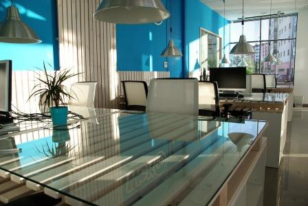
- This is another way in which the same obsession for Blue colour could be handled by balancing it with a lighter or less dominating colour like white. By maintaining just one wall of the colour, designer has allowed a lot of breathing space for the observer.
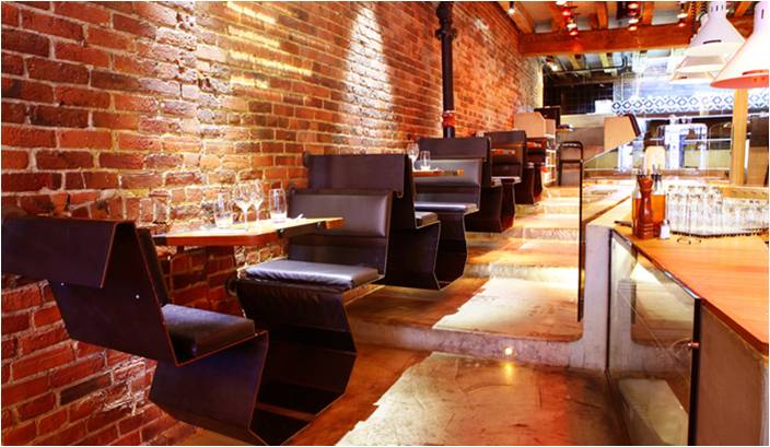
- Also, bright colours sometimes tend to fade or peel off showing it significantly. In such situations, its always comfortable to redo the whole wall if its treated singly.
2. Excessive use of Bright Colours
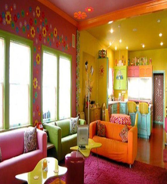
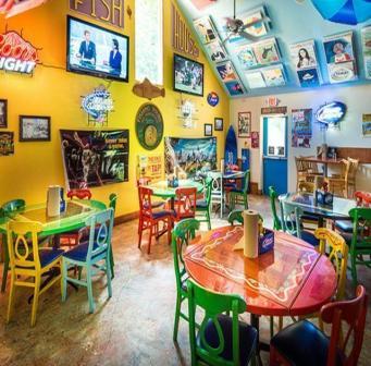
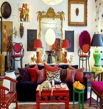
- Excessive use of colours is abusive. It’s visually tiresome & suffocating.
- While selecting each item, we might find the colour suitable for that item. But a collective effect is to be visualised of their final assembly.
- People sometimes over commit to the theme of the place like a restaurant or kids entertainment etc. But over treatment at any point is purely criminal & excessive use of saturated colours is the culprit element.
- Concentration of colour Vs the total volume in hand also is a deciding factor. In a larger space, brighter colours can be acceptable as only a smaller portion of the colours is going to fall in the picture frame at a time.
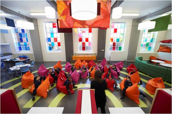
3. “Crowd is nothing but crowd”.
Each individual element is unique but together they are just leading to a crowded space.
- Sometimes people also tend to get carried away by graphics or shapes or elements. One needs to arrive at a personal scale of balance for the use of elements & textures both.
- Using curvilinear shapes deserve a deeper understating of context of design & scale at which they are being used. Also juxtaposing them with rectilinear volumes needs careful working.
- Literal but humble translation of theme, fascinations or inspirations impart a personal touch to the space. So bringing them in, with an adequate sense of balance is exactly what a designer is hired for.
In nutshell, Over-Treatment is the key to a disastrous outcome in Interiors. I would be elaborating on this topic more in my next blog
“Is Different always DIFFERENT in Interiors?” Part-2
At Excel Interior Design Institute,Nagpur we rope in experts from the industry to share their earned wisdom to differentiate between Treatment & Over-Treatment. For more on this, u can log on to https://excelinteriors.org/why-excel/
Recent Comments